
Photography Interpretation: Colors

Figure 1.--Colors can be deduced in various ways. Shades can be evaluated, that of course is how old black and white movies are colorized. There will probably eventually be software you can buy for this. In some
cases logic works. The band on this boy's sailor hat, for example, is obviously red, white, and blue. Presunmably the stripes in his sailor suit
and sailor collar are blue, buth there may have been red trim as well.
|
|
One aspect of historic clothing that the old black and white photographs do not provide is color. Some boys clothing is rather dark muted colors, black, greys, and dark greens, blues, and browns. Not all clothing are these colors. Unfortunately the black and white photography gives the impression that the clothes worn by boys were these muted colors. It is possible to make some assessments abot color in these old photographs. There are many sources of information on color. These sources do not resolve our color problem, but they fdo provide some useful information.
Color Information Needed
The dresses worn by boys came in a wide variety of colors. Even when special boy dresses appeared in the late 19th Century, colors were used. Perhaps more muted tham the girls' dresses, but still colors. Little
good information is availavle on the colors used for these dresses. Of course this problem affects efforts to assess womens and girls clothes as well. I ran across an account of the Utah statehood (or possibly womens vote) celebration where the author commented that in the photos the women appeared to be wearing dark dresses. He noted that the printed accounts of the event described the very same women bright almost garishly
colored dresses. I assume that the photo emusions of the day didn't react to the colors of the dresses so they appeared black in the pictures. (The early post-war movies did the same thing with red lipstick). Most people think that most Fauntleroy suits were black. Actually they came in a wide range of blues, burgandies, and greens. Because dark colors were often used, they came out as black in the photographs.
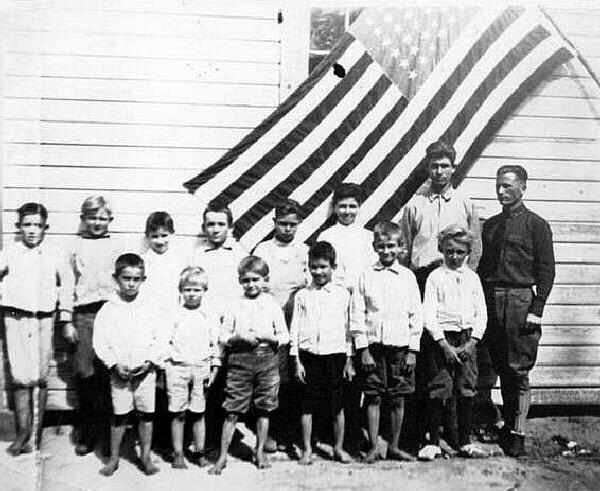
Figure 2.--Flags because the colors were known can provide some useful color reference points which can be useful in guessing the colors of garments. A problem here is that different films reproduce colors differently. Note here that the blue in the flag is lighter than the red. More modern films reprofduce the red darker.
|
|
Color Interpretation and Emulsion
Color interpretation is a very complicated subject and one made more difficult by the different chracteristics of various film emulsions used over time. Up to about 1900, the most common films were "orthochromatic" and insensitive to red. Therefore red objects show up as dark, even black. The advantage was that the photographer could use a dim red light when developing the negatives without harming the image. Enlargement and contact print paper, since they are only used on black and white negatives and since having light in the darkroom is very convenient, stayed orthochromatic to this day (if anyone still uses film). But around 1900 most negative film became "panchromatic" (=sensitive to all colors) and had to be developed in total darkness. With the change, reds began showing up as a gray shade. This effect is particularly norable in flags such as the American flag that use red, white, and blue (figure 1).
Specific Colors
We have begun to collect available information on specific colors and how they appear in black ajnd white images. This is partially dependant on the emulsion used.
Primary colors
The photo records on HBC, of course, all have hidden colors. The problem is to tease out just what shades represent what colors:
Blue: There are of course many different shades of blue.m We note that "orthochromatic" emulsions often shows blue as a very light color. Note that this is true of standard blue. A very dark blue like navy essentially has black mixed into it and thus shows up as a dark color.
Green:
Red: Red can show up as black or quite a dark grey. This is due to the use of "orthochromatic" emulsions during much of the 19th century and even the early 20th century. This includes the albumen CDVs and cabinent cards.
Yellow:
Hues
Color information of course is not a simple matter. Colors are not simple. There are thosands of hues and shades. Different shades of red can this look like a grey or black.
Identifiable colors
In some cases logic works. Some colors are associated with differet
countries. An American flag in a picture will provide shading details for red and blue. Annasyute observer might fing red, white, and blue used elsewhere--such as the band on a boys' sailor hat. The band on
the boy's sailor hat in fogure 1, for example,
is obviously red, white, and blue.
There are several important sources of information on the color of garments used in clothing. Know what colors were popular at any given time of course provides useful information when trying to assess the colors in old portraits. These different sources vary in both accessibility and relability. HBC is working hsrd to make these sources more accessible to readers. Reliability is a more difficult issue. Probably the most reliable is vintage clothing and catalogs. The problem with catalogs is that the colors mentioned often do not specify the particular shade. listings such as blue, green, and red cover a wide range of shades. Fairly reliable are printed portraits. Less reliable than paintings (especially oil paintings) are drawings and illustrations. Less reliable are tinted photographs, commercial postcards, and lithographic prints. Our color problems were no resloved until the 1970s when color photoigraphy and color illustrations in magazins and catalogs.
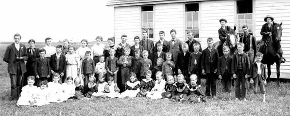
Figure 3.--This black and white image shows the students at a North Dakota prarrie school probably in the 1890s. Put your cursor on the image to see a colorized version. The easter-egg colored dresses are probably not a good depiction, but the other colors are probably representative of typical period costuming. One thing is for sure, the photographer would not have made a note of each indiciduals outfit in a group photograph like this.
|
|
From almost the beginning of photography studios have offered to colorize black-and-white images. There was even extensive colorization of Daguerreotype images. We note both colorized CDVs and cabinent cards as well as colorized portraits before Worlf War II. Colorized images like this may provide a great deal of
information about 19th Century and early 20th Ceentury photographs. The color information, however, has to be used with care. The accuracy of the colorization is highly variavle. The colorization was often done at a different studio than took the images. And usually only very basic was passed along to the colorizing studio. This was the case for individuals. The accracy of group portraits is even more suspect. A HBC contributor has provided us a colorized image of a prarrie school, located in South Dakota as an example of the information colorization offers. Whether or not one likes one prefers the colorized images, they are useful in determining what colors were popular as well as providing more imformation on clothing design.
Computer Colorization
All of us who enjoy old movies know that computerized colorization of old black and white movies are possible. Of course those of us who are purists rather object to this. Such colorizations, however, can yield valuable information about old clothing. One would assume that retail computer software will eventually appear that will permit the conversion of old black and white images. This will eventually yield some interesting information on the old images used in HBC.
Modern computers and programs like Photoshop allow old-photo buffs to colorize vintage images. These can produce very interesting images as to what the photographs would have looked like in color. We have tended not to use these images as we can never be sure about the accuracy, but the colorization often results in quite striking images. There are many standard colors that can give clues. Dark sailor suits, for example, are normally navy blue. Sandals are often redish brown. British school shorts are commonly grey. American school knickers were often brown corduroy. So the grey shades in the photographs a knowledge of fashion trends can help to produce very beautiful images. We hope as we develop HBC to compile information useful for such efforts. At best, however, these images should be considered educated guesses. They are also useful in discussing color.
HBC

Navigate the Boys' Historical Clothing Web Site:
[Return to:Main photo interpretation page]
[Return to:Main color photographt page]
[Return to:Main photo/publishing page]
[Introduction]
[Activities]
[Biographies]
[Chronology]
[Cloth and textiles]
[Clothing styles]
[Countries]
[Topics]
[Bibliographies]
[Contributions]
[FAQs]
[Glossaries]
[Images]
[Links]
[Registration]
[Tools]
[Boys' Clothing Home]
Navigate the Boys' Historical Clothing Web Site:
[Sailor hats]
[Sailor suits]
[Buster Brown suits]
[Eton suits]
[Rompers]
[Tunics]
[Smocks]
[Pinafores]
Created: January 14, 1999
Last updated: 9:01 AM 12/20/2008