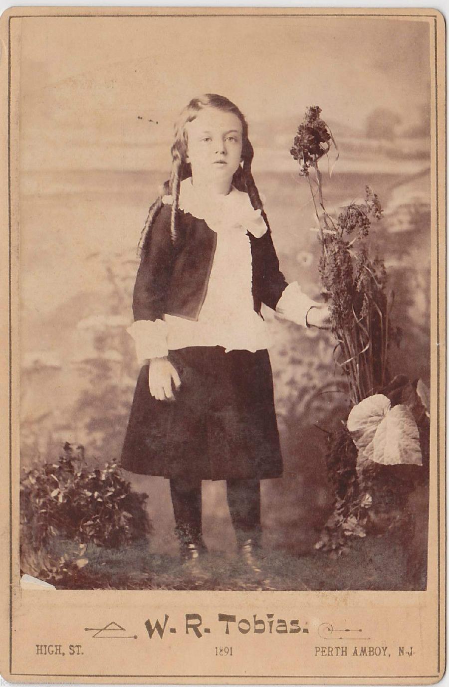
Figure 1.-- The bottom studio information on this cabinet card is a little different than we usually see. The studio is in the center rather than the left. The font or print style is also unusual. The year is printed on the front, 1891. |

|
Most but not all cabinet cards were studio portraits. And the style of the studio information at the bottom of the cards can also be helpful in dating the card. Unlike Europe, we almost never see the term cabinet card or cabinet portrait used on these American cards. The American cabinet cards are generally easy to identify because along with the name of the studio, the city and state is almost always indicated with a few exceptions. This was printed at the bottom of the card. The card here is a good example (figure 1). we also see raised and embossed lettering in the 1890s. Not all cards had this studio information, but the vast majority did. The arrngement and style of this information can help date the portraits. This was usually the name of the studio at the left, some sort of logo in the center, and the address and city at the right. Fancy script was commonly employed. The arrangment here is a good example, but arranged differently and with an unusual font than we usually see. At the turn of the century variations appeared, but through most of the 19th century (1860s-90s), this was the standard arrangement. Sometimes the year was added, but this was not common. Usually we have to reply on inscription on the back. There were cards with slightly different arrangements or no information at the bottom at all, but these were less common than the standard cards with the studio information.
Most but not all cabinet cards were studio portraits. And the style of the studio information at the bottom of the cards can also be helpful in dating the card. Unlike Europe, we almost never see the term cabinet card or cabinet portrait used on these American cards. The American cabinet cards are generally easy to identify because along with the name of the studio, the city and state is almost always indicated with a few exceptions. This was printed at the bottom of the card. The card here is a good example (figure 1). Not all cards had this studio information, but the vast majority did.
We also see raised/embossed or impressed lettering for the first time in the 1890s. We think that the embossed and impressed cards had very similar chronology, but can not yet conform that. One source suggests that cards with embossing date to the 1894-1900, at least on the classic cabinet card mounts. This sounds about right to us. And it offers an easy of dating these cards to a narrowly defind period. It is thus verybuseful, although brcause of the short time period, it affects only amall portion of cabinet cards. We have found examples from the mid- and late-1890. The card on the previous page was dated 1896. We are adding examples as we find dated cards to confirm this chronology. We have not yet found embossing after the turn-of-the 20th century. Studio impressed cards did not end in 1900. We notice impressed stidio informaton in the 1900s and 10s, but they were mostly on the new style mounts appearing at the turn-of-the 20th century, but we do not see embossing.
The arrangement and style of this information can help date the portraits. This was usually the name of the studio at the left, some sort of logo in the center, and the address and city at the right. Fancy script was commonly employed. The arrangment here is a good example, but arranged differently and with an unusual font than we usually see. At the turn of the century variations appeared, but through most of the 19th century (1860s-90s), this was the standard arrangement. Sometimes the year was added, but this was not common. Usually we have to reply on inscription on the back. There were cards with slightly different arrangements.
From a very early point we notice fancy florid script being used, mostly for the name of the studio. Often this makes the nme of the studios a little difficult to make out. We think the studios thiught that fancy scripts lent prestige to their image. We see them in use throughout the history if the 19th century classic style cabinet cards (1860s-90s). Usually it is easier to make out the studio name on the back of the card if there is back printing. The actual text for the location and some time he street address was almost always in a narrow range of fairly standard fonts. In the days before computers there was a nuch mofre limited numbr of fonts. But we begin to see some fancy fonts in the 1890s. A good example is the font here. We are not sure jut what to call it. It looks rather like Folia Mix. Perhaps readers will know more. We do not see many with this fancy fonts but we do see a few. We see this font so far in 1891 examples so we do not yet have a precise range.
There were also cards wih no information at the bottom at all, but these were less common than the standard cards with the studio information.

Navigate the Boys' Historical Clothing Web Site:
[Return to:Main U.S. classic-style cabinet card format and size page]
[Return to:Main U.S. cabinet card format and size page]
[Return to:Main U.S. cabinet card page]
[Return to:Main cabinet card country page]
[Return to:Main cabinet card page]
[Return to:Main American photography page]
[Return to:Main photographic print type page]
[Return to:Main photography page]
[Introduction]
[Activities]
[Biographies]
[Chronology]
[Clothing styles]
[Countries]
[Bibliographies]
[Contributions]
[FAQs]
[Glossaries]
[Images]
[Links]
[Registration]
[Tools]
[Boys' Clothing Home]
Navigate the Boys' Historical Clothing Web Site:
[Sailor suits]
[Sailor hats]
[Buster Brown suits]
[Eton suits]
[Rompers]
[Tunics]
[Smocks]
[Pinafores]